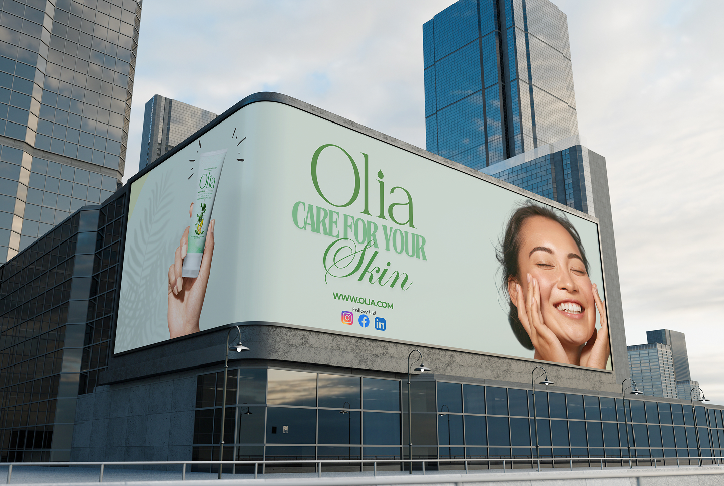
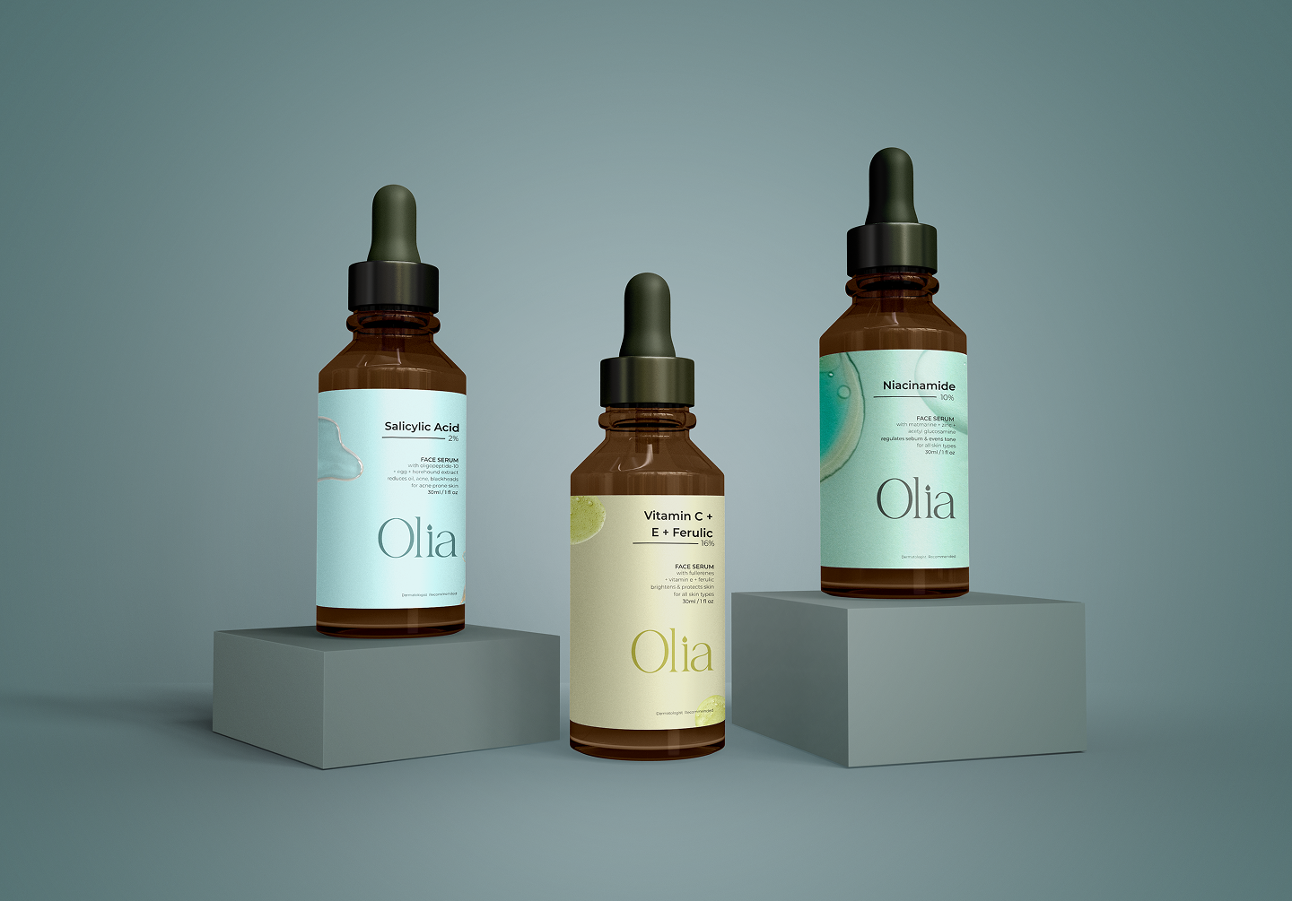
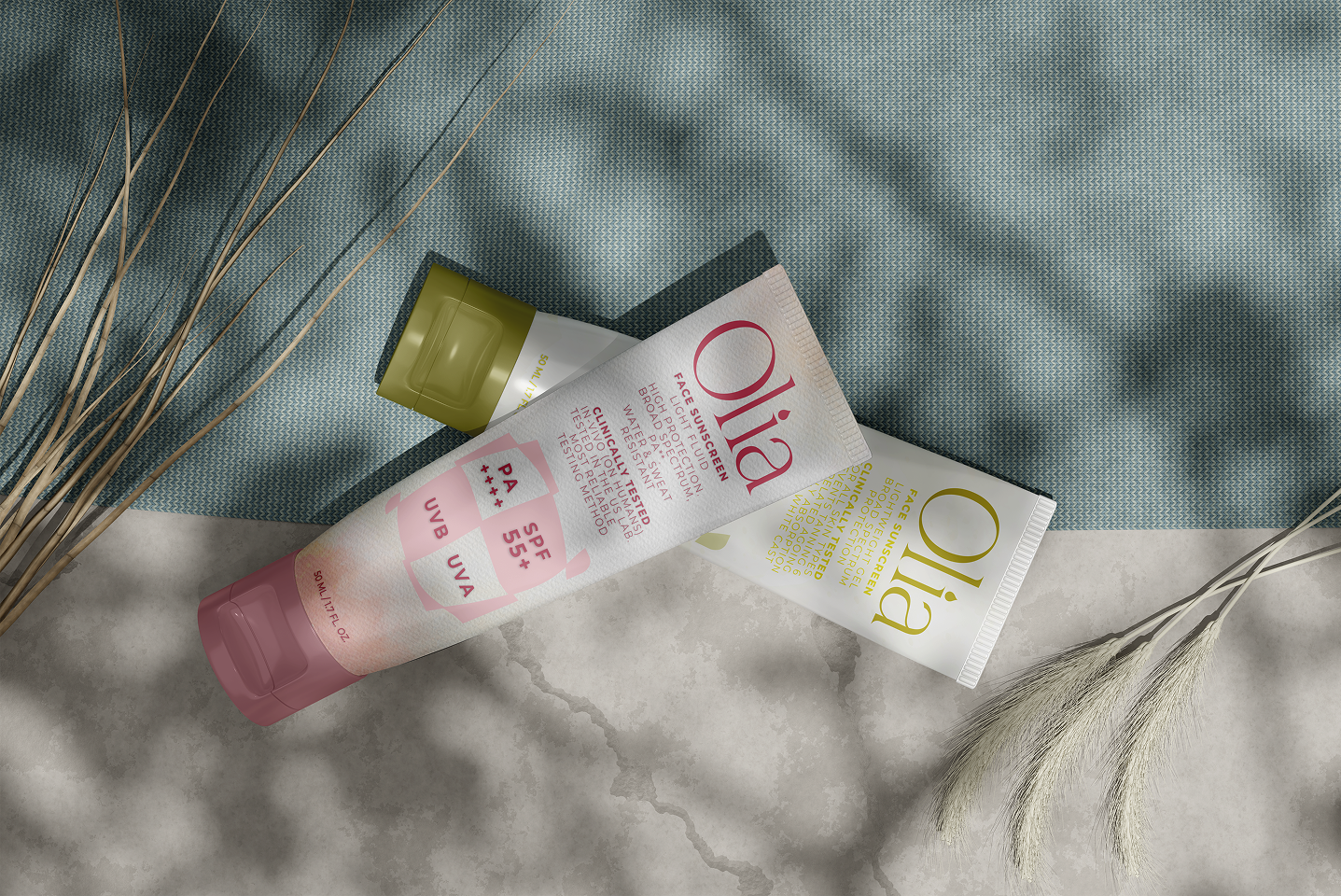
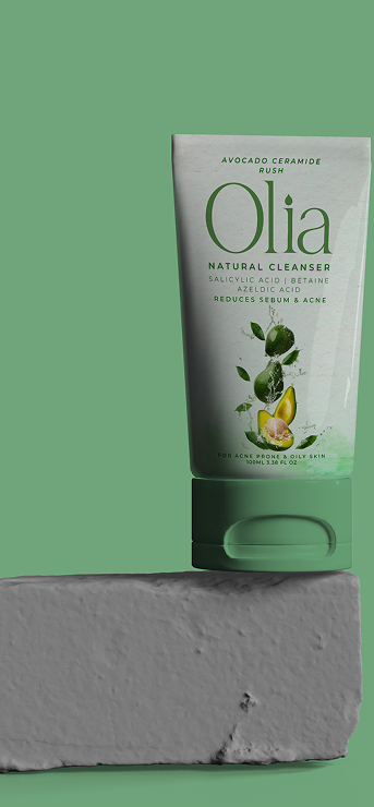
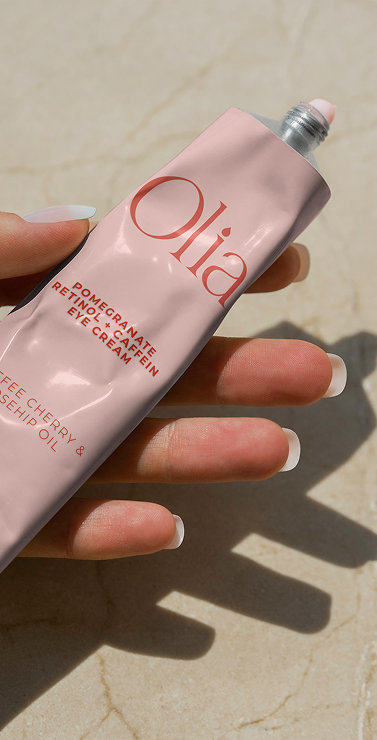
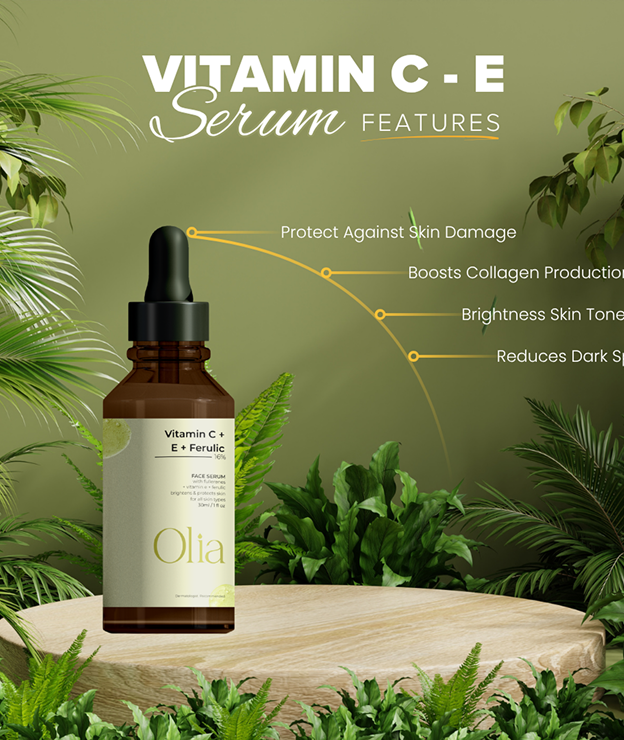
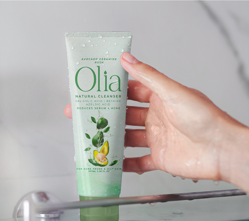
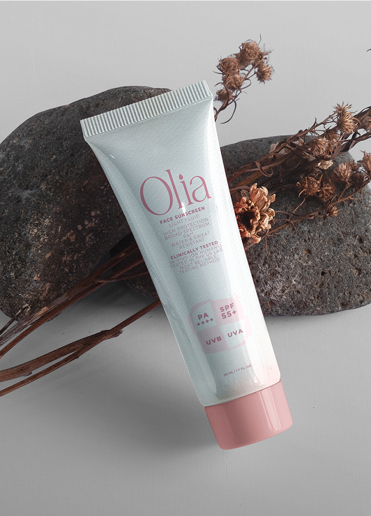
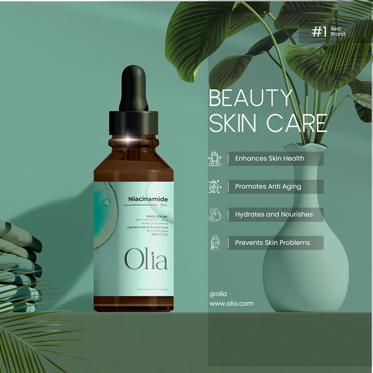
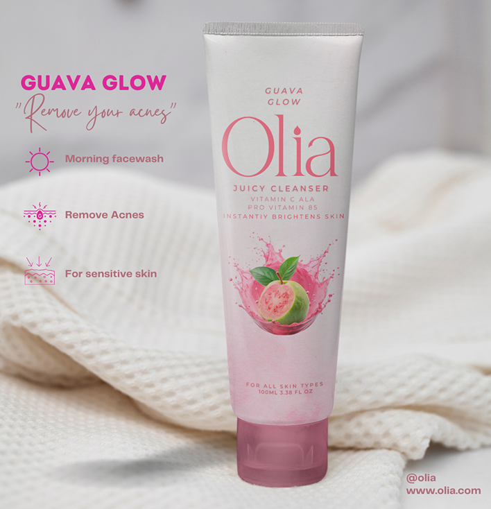
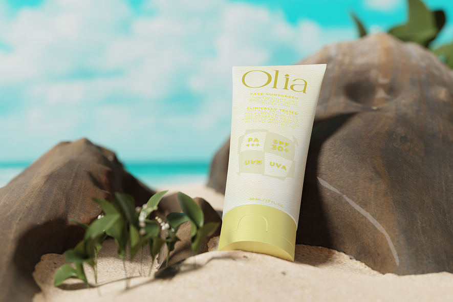
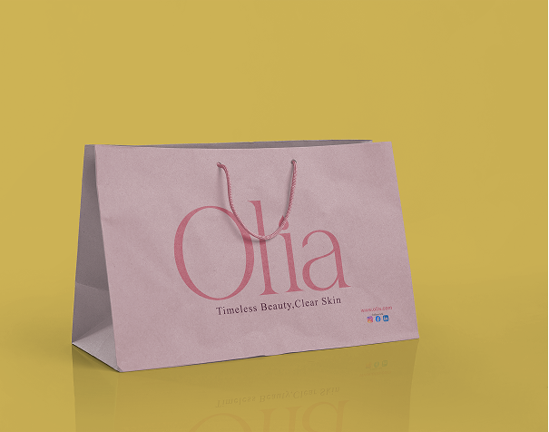
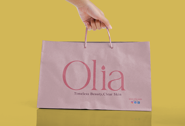
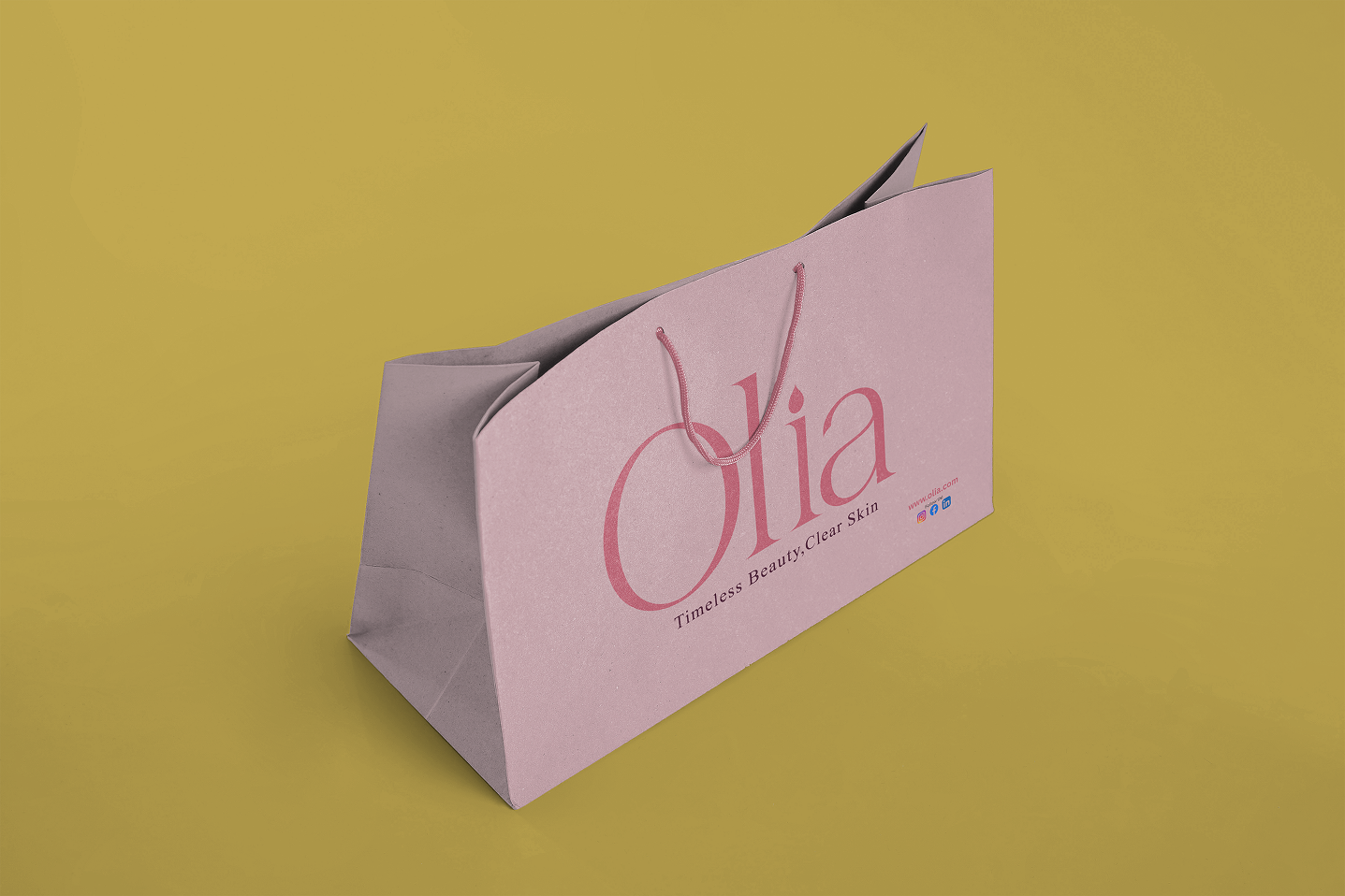
In a crowded skincare market, Olia stands apart by championing the gentle power of nature's finest oils. The brand identity is rooted in the concept of “illuminated nature,” promising to restore the skin’s radiance through pure, scientifically perfected botanical oils. Olia’s logo, a stylized droplet with an infused leaf, captures this fusion of nature and science. This serene identity is applied across all touchpoints, from the elegant, soft-gold accented packaging to the clean website. The result is a brand that speaks a language of quiet confidence, offering a skincare ritual that is both beautifully simple and profoundly effective.
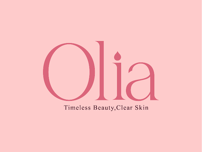
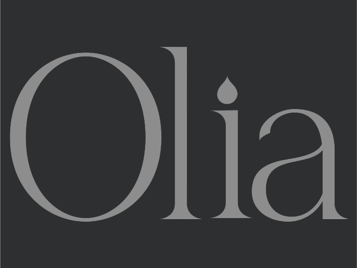
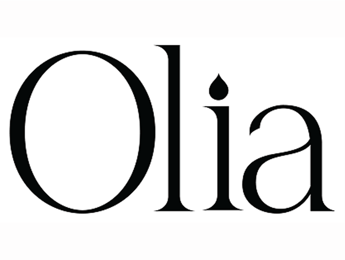
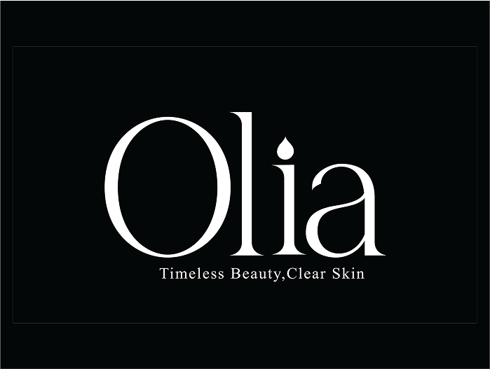
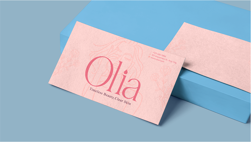
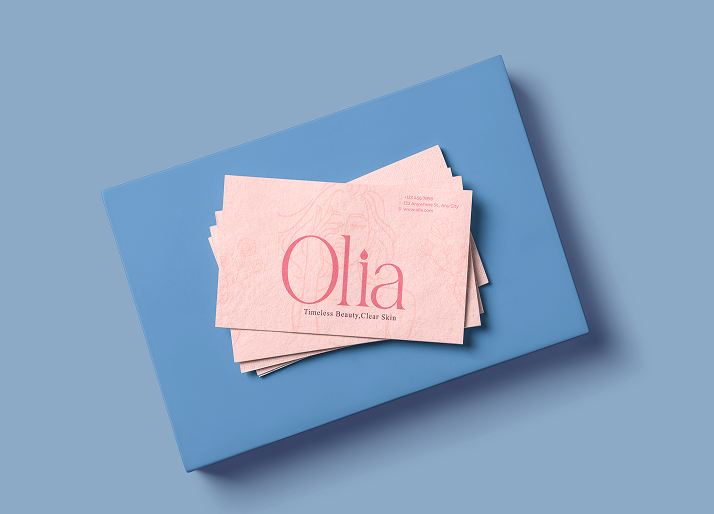
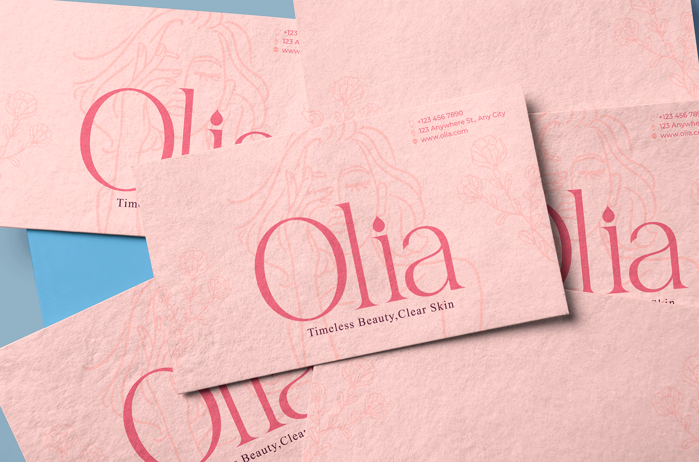
At the heart of Olia’s brand identity is its graceful logotype, an emblem of serenity and purity that takes center stage on every product and brand touchpoint. The elegant, classic lettering conveys a sense of timeless sophistication, while the integrated droplet motif symbolizes the pure, concentrated essence of hydration. This design perfectly captures Olia’s mission to nurture and clarify, promising enduring beauty with every drop. Spanning across the skincare line, the logotype becomes a delicate visual statement reassuring, elegant, and unmistakably Olia.
Olia’s serene voice is articulated through a sophisticated typographic pairing. Taking the lead is Playfair Display, the brand’s primary typeface, a graceful serif that exudes timeless elegance. It’s poised, refined, and classic, bringing a touch of quiet luxury to headlines and brand statements. To support this elegance with accessible warmth, Lato steps in with clarity and sincerity. Clean, friendly, and exceptionally readable, it brings a sense of trust and ease to moments where ingredients and instructions take the lead. Together, this duet forms a harmonious system, speaking with grace, informing with clarity, and ensuring Olia’s gentle voice resonates at every touchpoint.
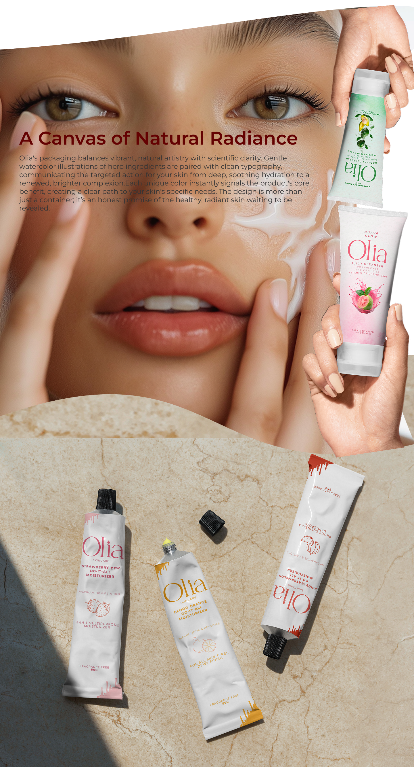
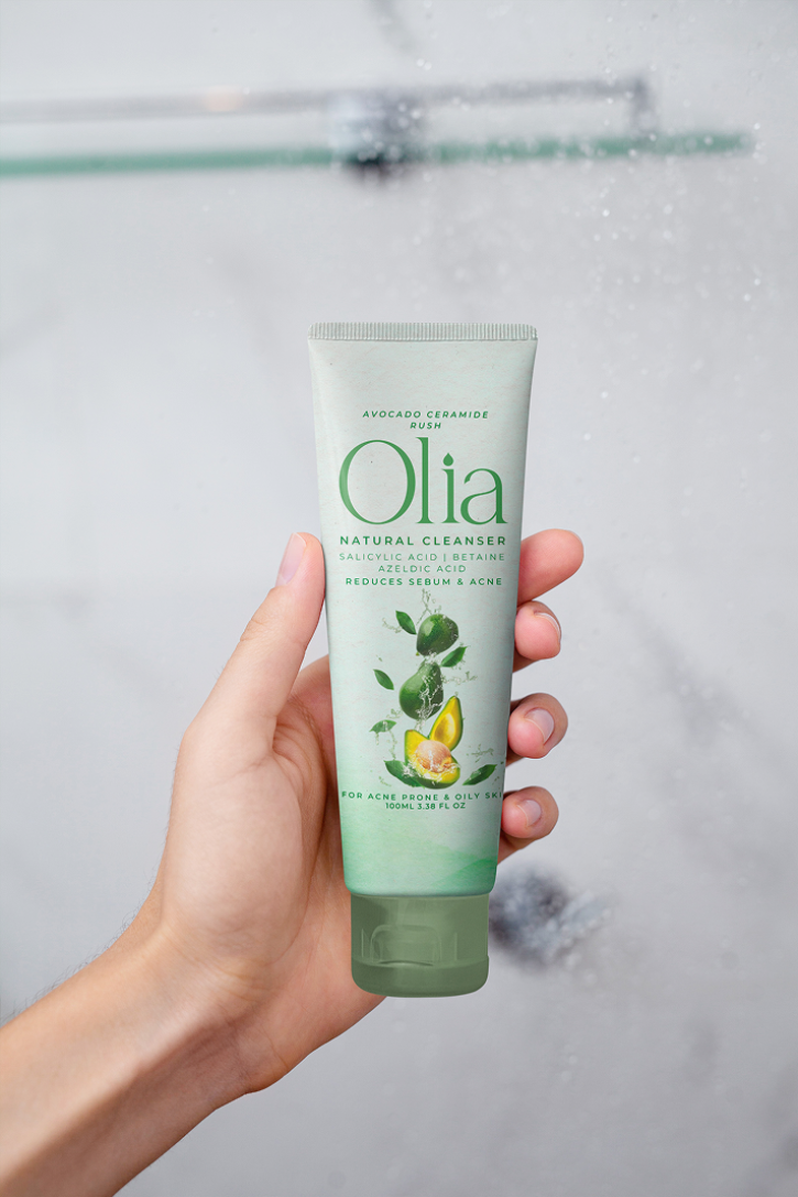
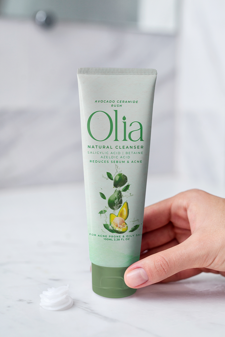
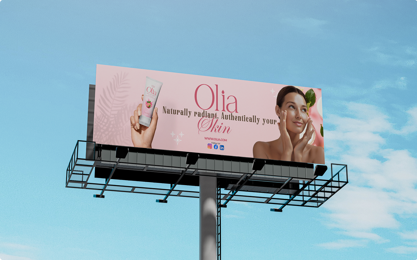
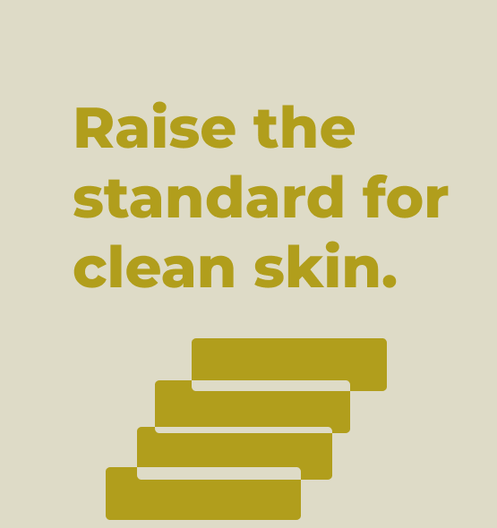
Olia's visual direction is a serene celebration of natural radiance. Through soft-light photography, elegant compositions, and clean, spacious design, every element exudes a profound sense of calm and clarity. This visual language embodies our “Pure, Calm, Luminous” ethos, reflecting a philosophy of gentle care. It’s a quiet manifesto for those who value peace, purity, and seek to reveal their own natural glow.

If you have questions, feel free to contact our expert for assistance.